Custom Labels
The “Custom Labels” add-on allows you to add customizable labels with multiple settings for backgrounds, borders, texts, icons. It also includes 13 animations which can be individually assigned to the whole label, text and icon. Each label can be set to display automatically based on various conditions or may be manually assigned to products and catalog promotions.

Please follow the steps below in order to learn how to create and customize Custom Labels.
- Step 1
In your admin panel, go to “Add-ons” - “EnergoThemes Add-ons” - “Custom labels”
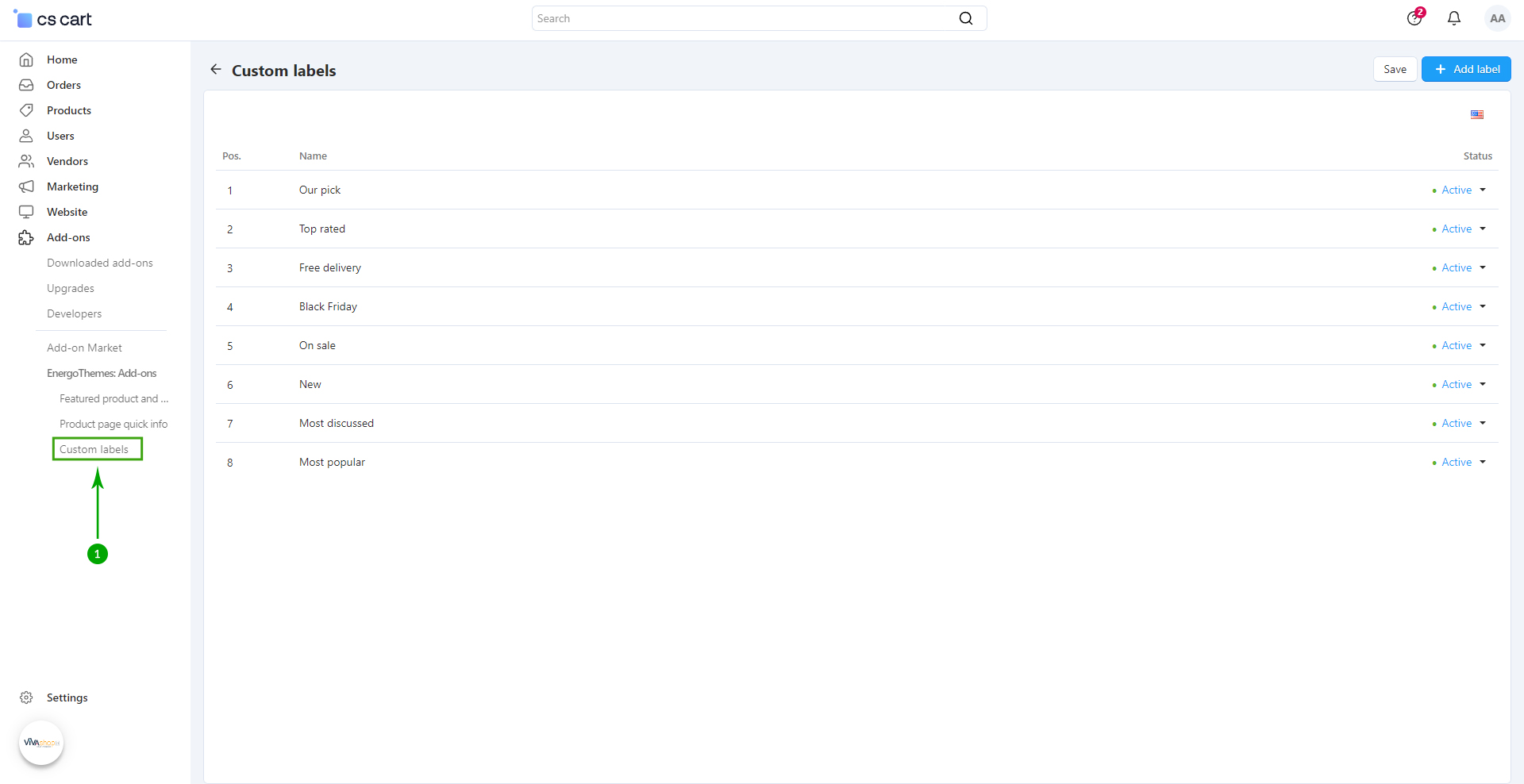
- Step 2
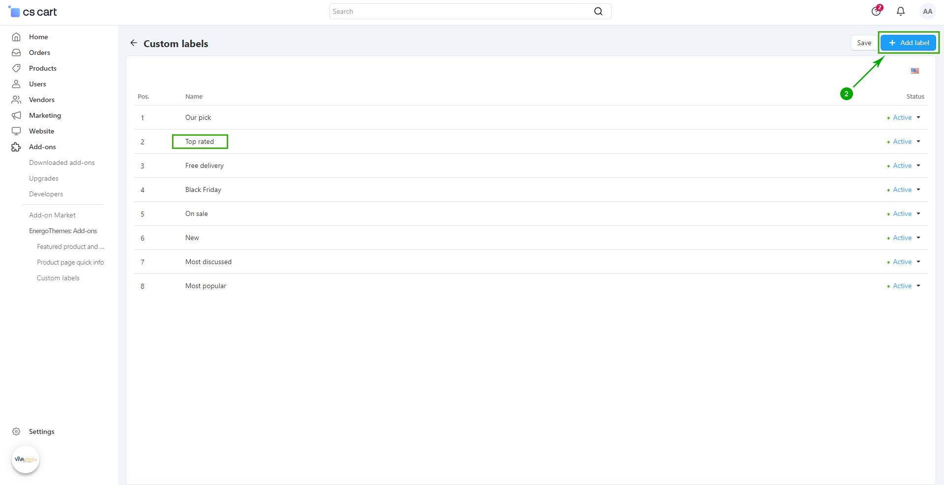
In the next page click on the right side “+ Add label” to add a new Label. For the sake of the example, we have clicked on the label called “Top rated” that we have created.
- Step 3
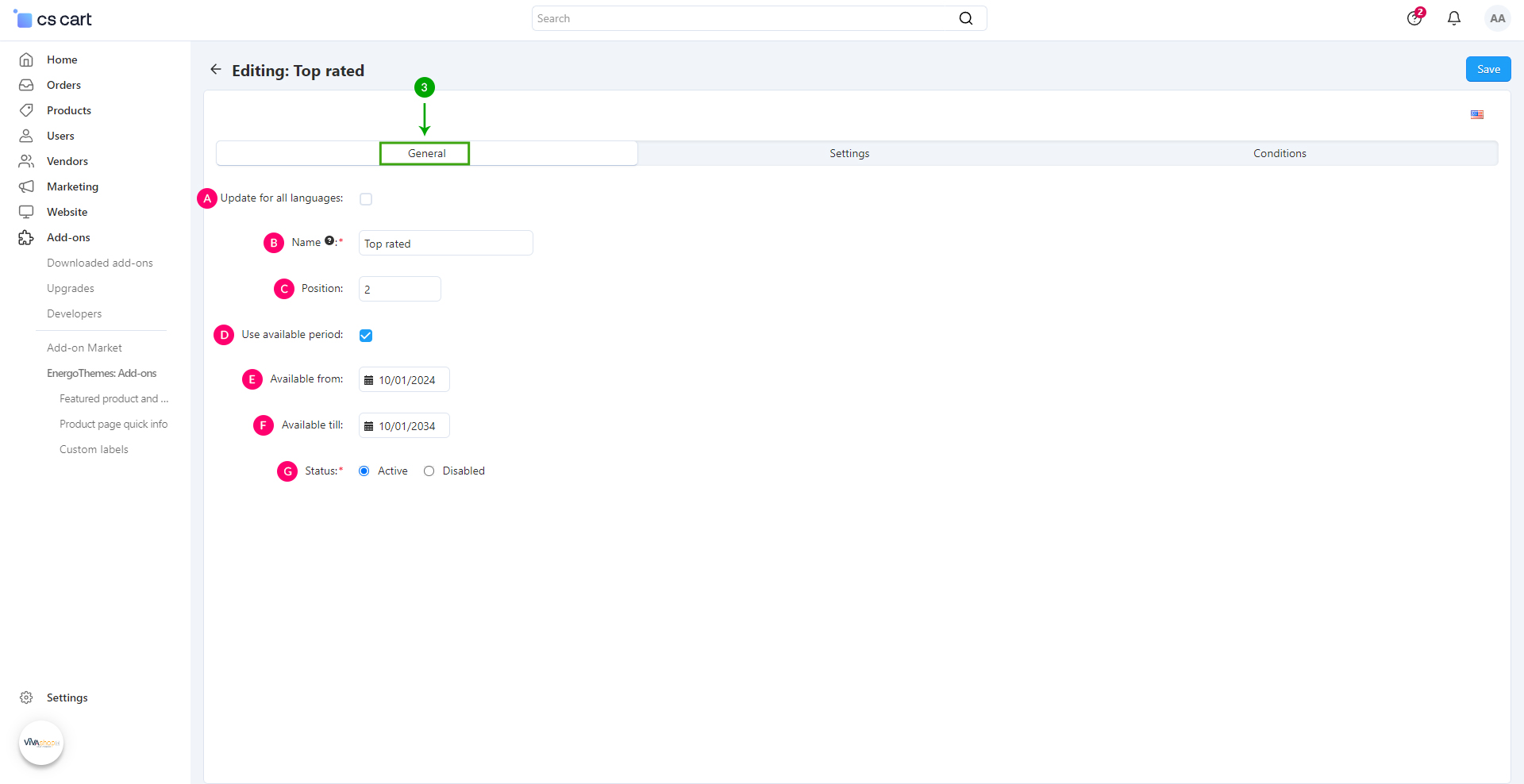
In the newly opened page, choose your own settings for your newly created Custom label. As an example, we’ll show you the settings we have chosen for the “Top rated” label. When you’re done, click on the top right blue “Save” button
- Step 4
In order to change the Custom label settings, click on the “Settings” tab
Text and icon
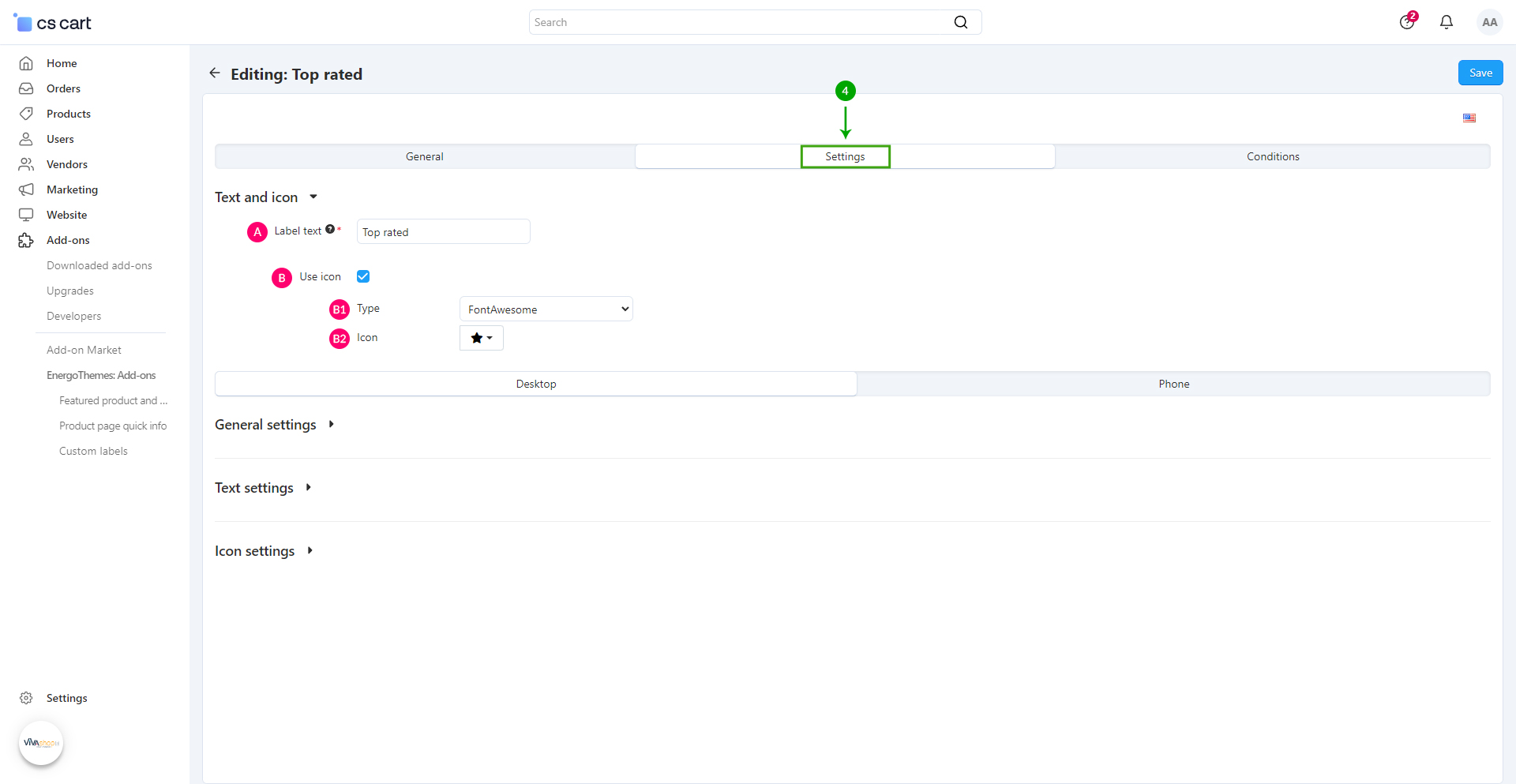
- B1: Type - If you chose to add an icon to your Custom label, select the type of icon you want to use. You can choose between picking a “Font Awesome” icon, or add your own “Custom” icon. We have chosen a Font Awesome icon in this example
- B2: Icon - Select the icon you want to use from the Icon picker
Desktop - General settings
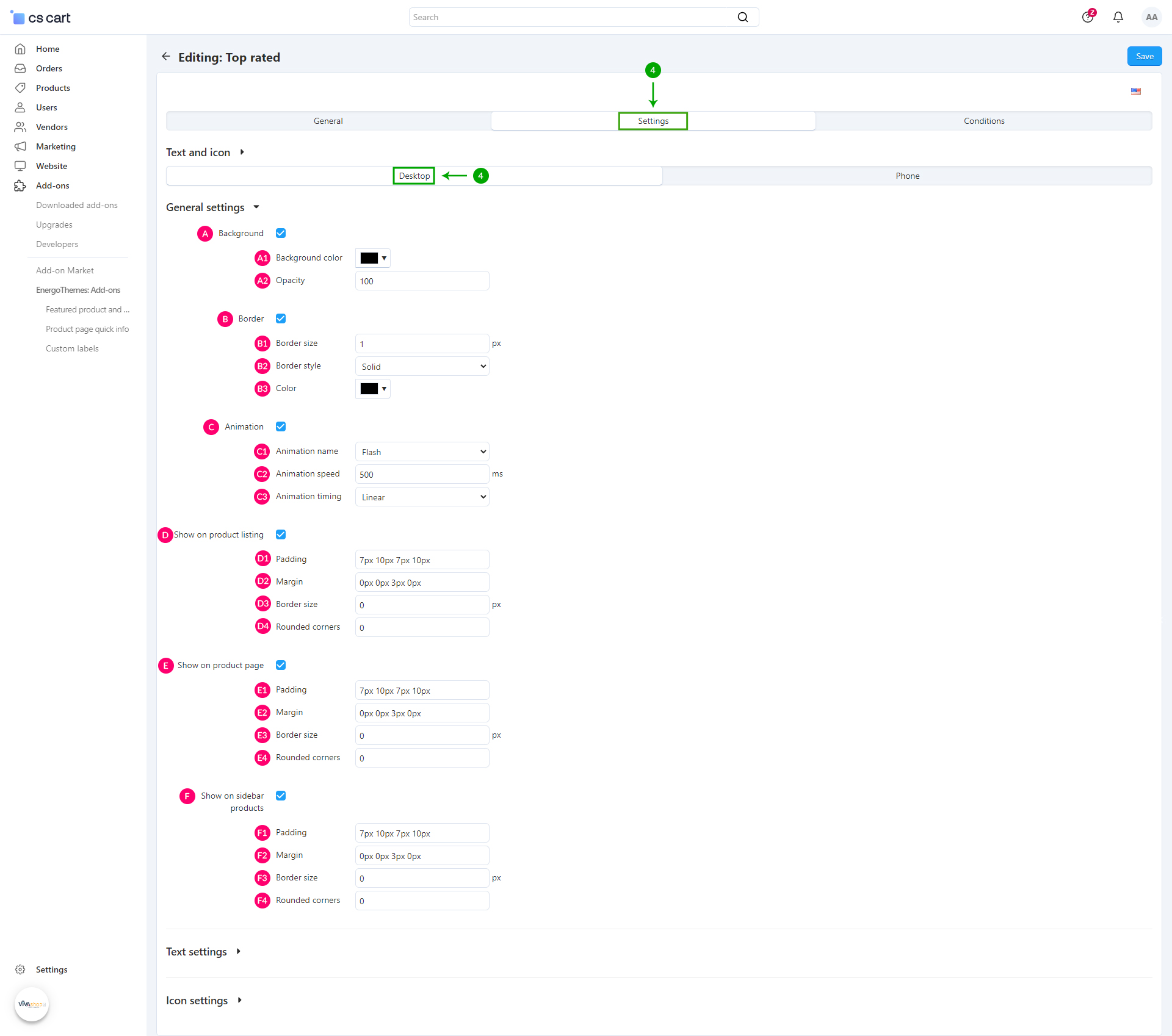
- A1: Background Color - From the color picker choose the color for your Custom label
- A2: Opacity - Enter the desired opacity level, in percentages
- B1: Border size - Enter the size in pixels for the Custom label border
-
B2: Border style - Here you have 3 options that you can select from the dropdown:
- - Solid
- - Dashed
- - Dotted
- B3: Color - Pick the color for your button border
-
C1: Animation name - Here you have 13 options that you can select from the dropdown:
- - Flash
- - Pulse
- - RubberBand
- - Swing
- - Tada
- - Wobble
- - Rotate
- - ShakeX
- - ShakeY
- - HeadShake
- - Jello
- - HeartBeat
- - Flip
- C2: Animation speed - Enter the speed of the animation in milliseconds. So if you want the animation to take half a second use 500ms and if you want it to take five seconds use 5000ms
-
C3: Animation timing - Here you have 5 options that you can select from the dropdown:
- - Linear - The animation has the same speed throughout its animation cycle
- - Ease - The animation starts slow, speeds up, then slows down
- - Ease-in - The animation has a slow start, then gradually speeds up
- - Ease-out - The animation has a quick start and slow end
- - Ease-in-out - The animation has a slow start and end
- D1: Padding - Set the padding for your Custom label
Padding is used to generate space around an element's content, inside of any defined background and border. For example, if you set a padding to the left of the Custom label, there will be a space created to the left of the Custom label content, and the content will move to the right without the background/border moving. The more padding to the left, the more the content will move to the right. The setting format is like for example, “TTpx RRpx BBpx LLpx”, where “TT” is the size of the padding top (space is created on top, so Custom label content is pushed to the bottom), “RR” is the size of the padding right (space is created on the right, so the label content is pushed to the left), “BB” is the size of the padding bottom (space is created at the bottom, so the Custom label content is pushed up), and “LL” is the size of the padding left (space is created on the left, so Custom label content is pushed to the right).
- D1: Margin - Set the spaces you want to add outside the Custom label
Margins are used to generate space around an element's content, outside of any defined background and border. For example, if you set a margin to the left of the Custom label, the Custom label will be pushed to the right including the background/border. If you set a margin up, the Custom label will be pushed down, and so on. The setting format is like for example “TTpx RRpx BBpx LLpx”, where “TT” is the size of the margin top (Custom label is pushed to the bottom), “RR” is the size of the margin right (Custom label is pushed to the left), “BB” is the size of the margin bottom (Custom label is pushed up), and “LL” is the size of the margin left (Custom label is pushed to the right).
- D3: Border size - Enter the size in pixels for the Custom label border
- D4: Rounded corners - Set the corner radius for your Custom label
The setting format is like for example, “TLpx TRpx BRpx BLpx”, where “TL” is the value for the top left corner, “TR” is the value for the top right corner , “BR” is the value for the bottom right corner, and “BL” is the value for the bottom left corner. These values are in pixels. In the above example we have used “10px 0px 10px 0px”, meaning that all background corners have a 10px radius in the top left and bottom right.
- E1: Padding - Enter the padding values
- E2: Margin - Enter the margin values
- E3: Border size - Enter the size in pixels for the Custom label border
- E4: Rounded corners - Enter the rounded corner values for your Custom label
- F1: Padding - Enter the padding values
- F2: Margin - Enter the margin values
- F3: Border size - Enter the size in pixels for the Custom label border
- F4: Rounded corners - Enter the rounded corner values for your Custom label
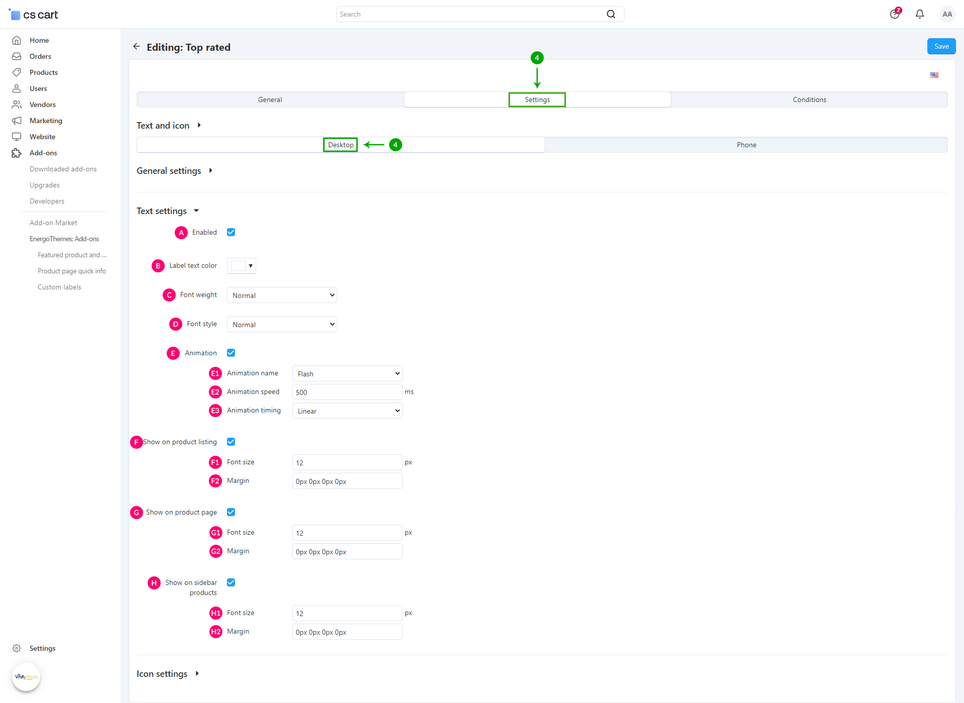
Desktop - Text settings
- Normal
- Light
- Bold
- Normal
- Italic
-
E1: Animation name - Here you have 13 options that you can select from the dropdown:
- - Flash
- - Pulse
- - RubberBand
- - Swing
- - Tada
- - Wobble
- - Rotate
- - ShakeX
- - ShakeY
- - HeadShake
- - Jello
- - HeartBeat
- - Flip
- E2: Animation speed - Enter the speed of the animation in milliseconds. So if you want the animation to take half a second use 500ms and if you want it to take five seconds use 5000ms
-
E3: Animation timing - Here you have 5 options that you can select from the dropdown:
- - Linear - The animation has the same speed throughout its animation cycle
- - Ease - The animation starts slow, speeds up, then slows down
- - Ease-in - The animation has a slow start, then gradually speeds up
- - Ease-out - The animation has a quick start and slow end
- - Ease-in-out - The animation has a slow start and end
- F1: Font size - The size of the Custom label text in pixels on the product listing
- F2: Margin - Set the spaces you want to add outside the Custom label text on the product listing
- G1: Font size - The size of the Custom label text in pixels on the product page
- G2: Margin - Set the spaces you want to add outside the Custom label text on the product page
- H1: Font size - The size of the Custom label text in pixels on the sidebar products
- H2: Margin - Set the spaces you want to add outside the Custom label text on the sidebar products
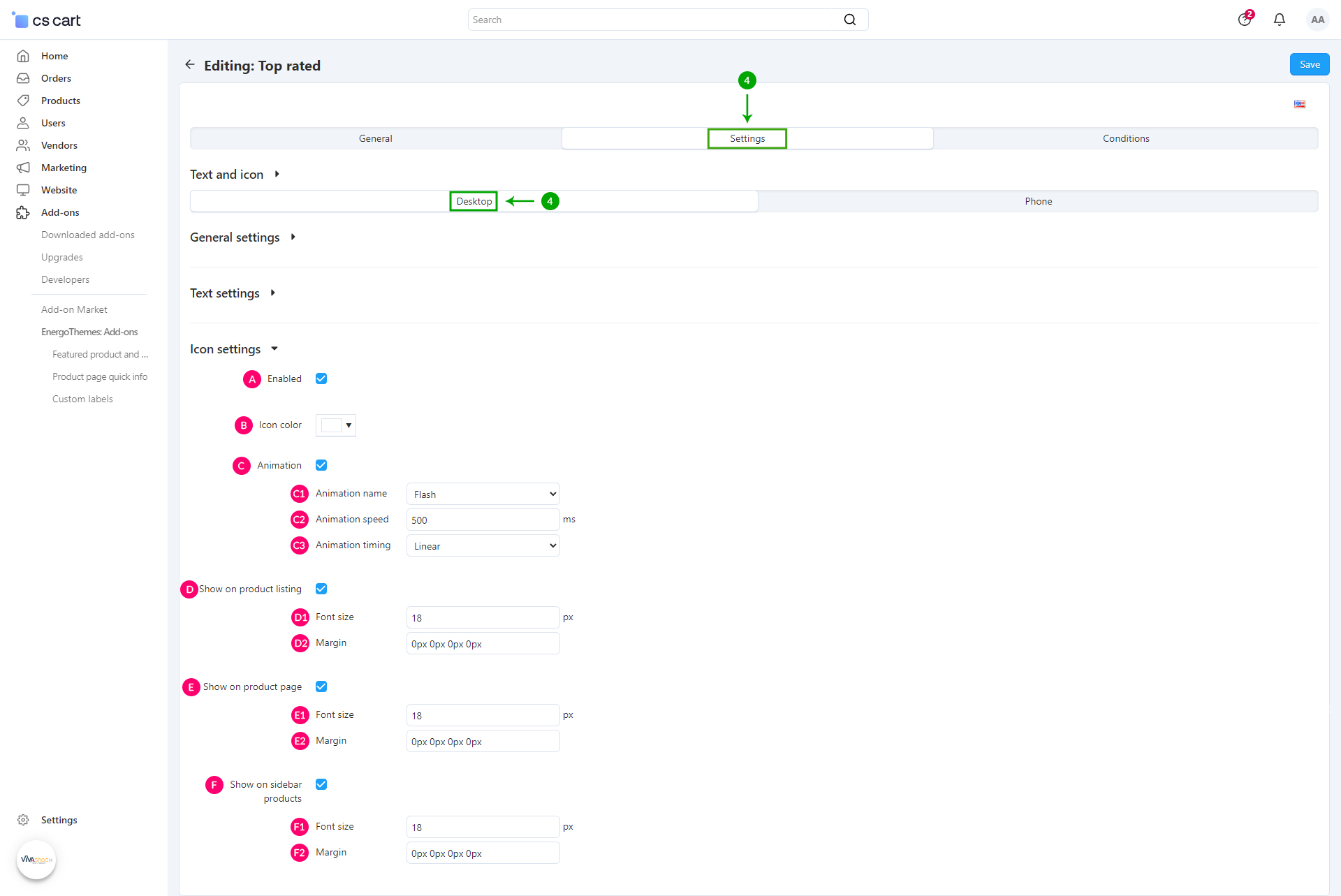
Desktop - Icon settings
-
C1: Animation name - Here you have 13 options that you can select from the dropdown:
- - Flash
- - Pulse
- - RubberBand
- - Swing
- - Tada
- - Wobble
- - Rotate
- - ShakeX
- - ShakeY
- - HeadShake
- - Jello
- - HeartBeat
- - Flip
- C2: Animation speed - Enter the speed of the animation in milliseconds. So if you want the animation to take half a second use 500ms and if you want it to take five seconds use 5000ms
-
C3: Animation timing - Here you have 5 options that you can select from the dropdown:
- - Linear - The animation has the same speed throughout its animation cycle
- - Ease - The animation starts slow, speeds up, then slows down
- - Ease-in - The animation has a slow start, then gradually speeds up
- - Ease-out - The animation has a quick start and slow end
- - Ease-in-out - The animation has a slow start and end
- D1: Font size - The size of the Custom label icon in pixels on the product listing
- D2: Margin - Set the margin you want to add outside the Custom label icon on the product listing
- E1: Font size - The size of the Custom label icon in pixels on the product page
- E2: Margin - Set the margin you want to add outside the Custom label icon on the product page
- F1: Font size - The size of the Custom label icon in pixels on the sidebar products
- F2: Margin - Set the margin you want to add outside the Custom label icon on the sidebar products
Phone - General settings
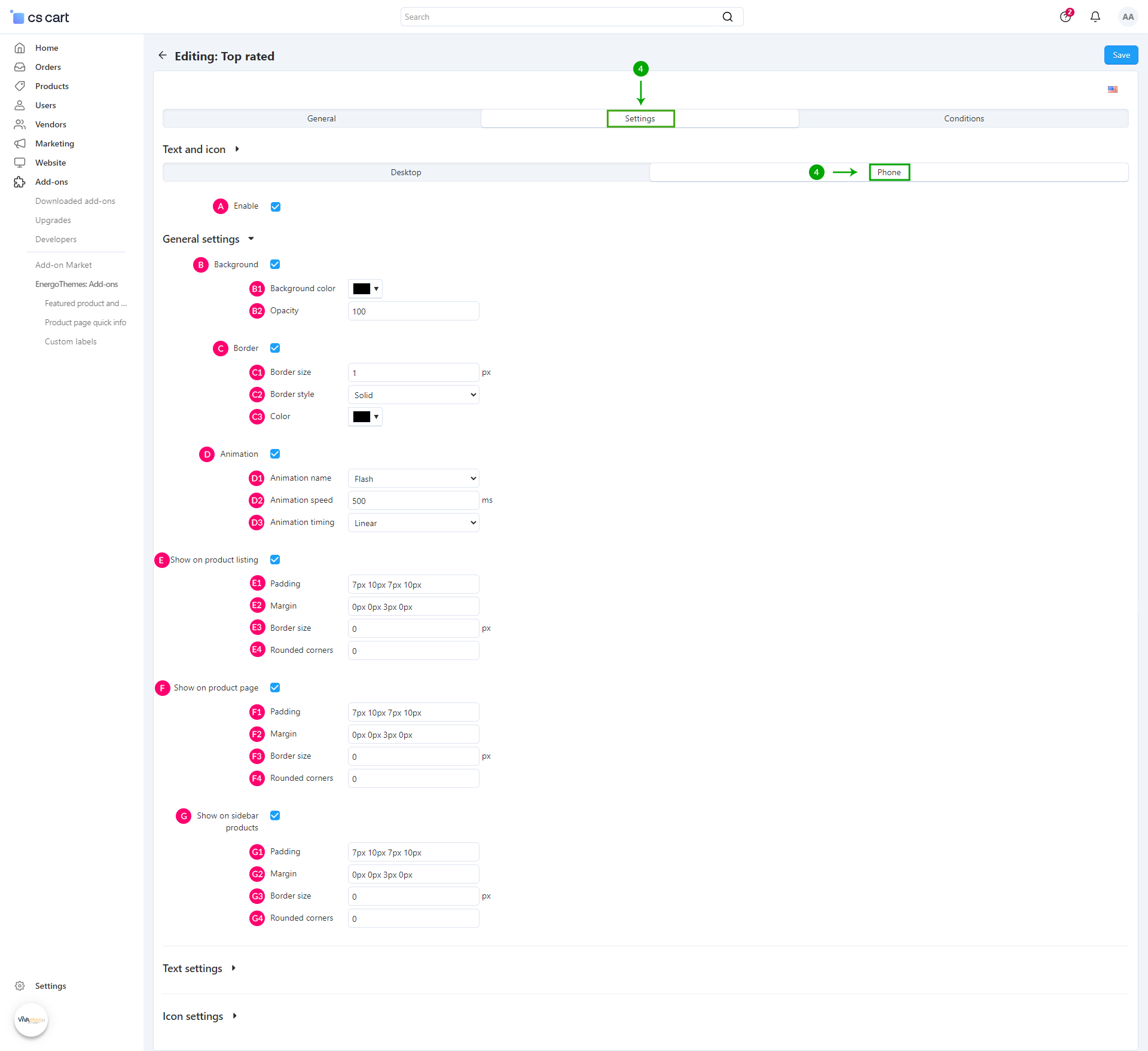
- B1: Background Color - From the color picker choose the color for your Custom label
- B2: Opacity - Enter the desired opacity level, in percentages
- C1: Border size - Enter the size in pixels for the Custom label border
-
C2: Border style - Here you have 3 options that you can select from the dropdown:
- - Solid
- - Dashed
- - Dotted
- C3: Color - Pick the color for your button border
-
D1: Animation name - Here you have 13 options that you can select from the dropdown:
- - Flash
- - Pulse
- - RubberBand
- - Swing
- - Tada
- - Wobble
- - Rotate
- - ShakeX
- - ShakeY
- - HeadShake
- - Jello
- - HeartBeat
- - Flip
- D2: Animation speed - Enter the speed of the animation in milliseconds. So if you want the animation to take half a second use 500ms and if you want it to take five seconds use 5000ms
-
D3: Animation timing - Here you have 5 options that you can select from the dropdown:
- - Linear - The animation has the same speed throughout its animation cycle
- - Ease - The animation starts slow, speeds up, then slows down
- - Ease-in - The animation has a slow start, then gradually speeds up
- - Ease-out - The animation has a quick start and slow end
- - Ease-in-out - The animation has a slow start and end
- E1: Padding - Set the padding for your Custom label
Padding is used to generate space around an element's content, inside of any defined background and border. For example, if you set a padding to the left of the Custom label, there will be a space created to the left of the Custom label content, and the content will move to the right without the background/border moving. The more padding to the left, the more the content will move to the right. The setting format is like for example, “TTpx RRpx BBpx LLpx”, where “TT” is the size of the padding top (space is created on top, so Custom label content is pushed to the bottom), “RR” is the size of the padding right (space is created on the right, so the label content is pushed to the left), “BB” is the size of the padding bottom (space is created at the bottom, so the Custom label content is pushed up), and “LL” is the size of the padding left (space is created on the left, so Custom label content is pushed to the right).
- E1: Margin - Set the spaces you want to add outside the Custom label
Margins are used to generate space around an element's content, outside of any defined background and border. For example, if you set a margin to the left of the Custom label, the Custom label will be pushed to the right including the background/border. If you set a margin up, the Custom label will be pushed down, and so on. The setting format is like for example “TTpx RRpx BBpx LLpx”, where “TT” is the size of the margin top (Custom label is pushed to the bottom), “RR” is the size of the margin right (Custom label is pushed to the left), “BB” is the size of the margin bottom (Custom label is pushed up), and “LL” is the size of the margin left (Custom label is pushed to the right).
- E3: Border size - Enter the size in pixels for the Custom label border
- E4: Rounded corners - Set the corner radius for your Custom label
The setting format is like for example, “TLpx TRpx BRpx BLpx”, where “TL” is the value for the top left corner, “TR” is the value for the top right corner , “BR” is the value for the bottom right corner, and “BL” is the value for the bottom left corner. These values are in pixels. In the above example we have used “10px 0px 10px 0px”, meaning that all background corners have a 10px radius in the top left and bottom right.
- F1: Padding - Enter the padding values
- F2: Margin - Enter the margin values
- F3: Border size - Enter the size in pixels for the Custom label border
- F4: Rounded corners - Enter the rounded corner values for your Custom label
- G1: Padding - Enter the padding values
- G2: Margin - Enter the margin values
- G3: Border size - Enter the size in pixels for the Custom label border
- G4: Rounded corners - Enter the rounded corner values for your Custom label
Phone - Text settings
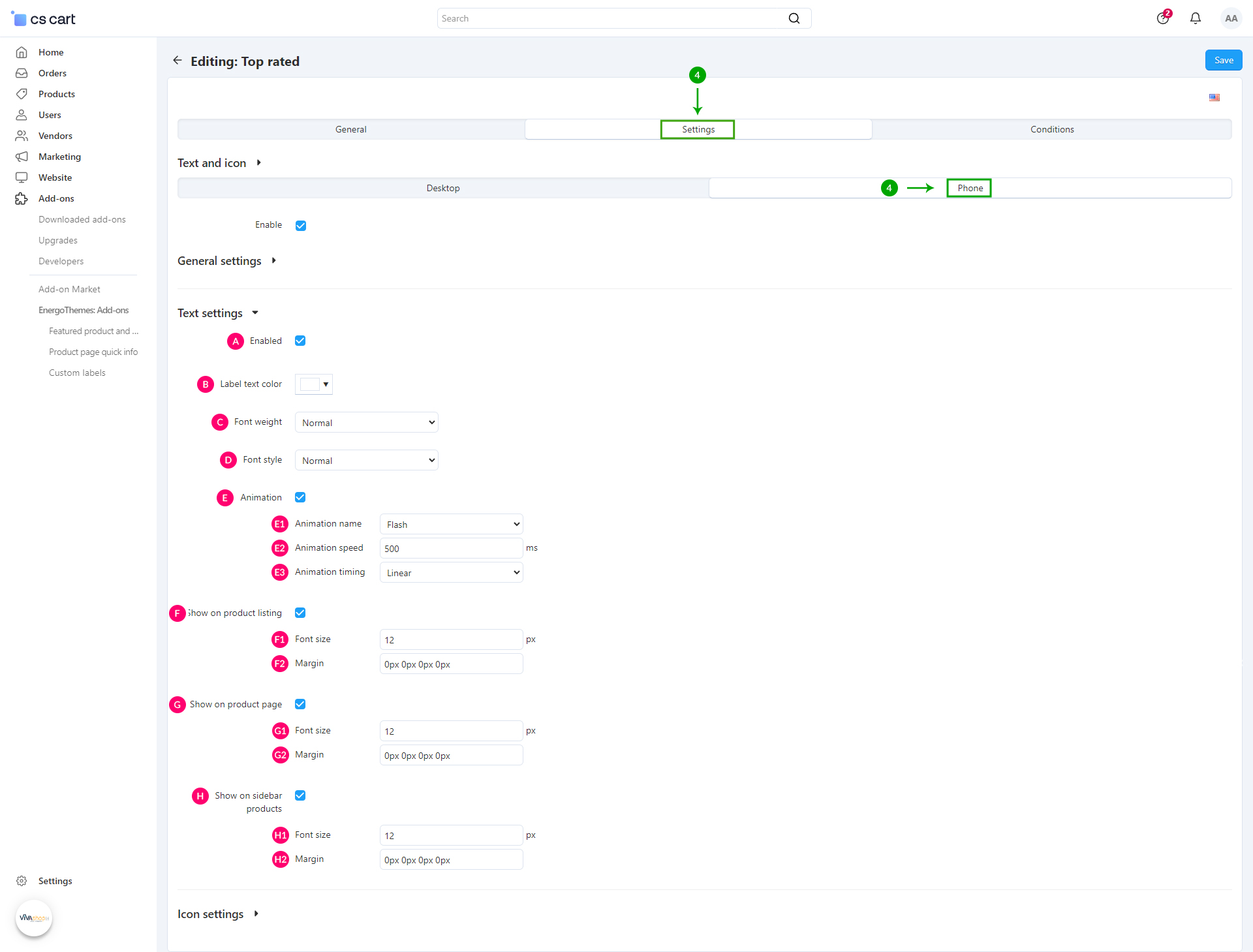
- Normal
- Light
- Bold
- Normal
- Italic
-
E1: Animation name - Here you have 13 options that you can select from the dropdown:
- - Flash
- - Pulse
- - RubberBand
- - Swing
- - Tada
- - Wobble
- - Rotate
- - ShakeX
- - ShakeY
- - HeadShake
- - Jello
- - HeartBeat
- - Flip
- E2: Animation speed - Enter the speed of the animation in milliseconds. So if you want the animation to take half a second use 500ms and if you want it to take five seconds use 5000ms
-
E3: Animation timing - Here you have 5 options that you can select from the dropdown:
- - Linear - The animation has the same speed throughout its animation cycle
- - Ease - The animation starts slow, speeds up, then slows down
- - Ease-in - The animation has a slow start, then gradually speeds up
- - Ease-out - The animation has a quick start and slow end
- - Ease-in-out - The animation has a slow start and end
- F1: Font size - The size of the Custom label text in pixels on the product listing
- F2: Margin - Set the spaces you want to add outside the Custom label text on the product listing
- G1: Font size - The size of the Custom label text in pixels on the product page
- G2: Margin - Set the spaces you want to add outside the Custom label text on the product page
- H1: Font size - The size of the Custom label text in pixels on the sidebar products
- H2: Margin - Set the spaces you want to add outside the Custom label text on the sidebar products
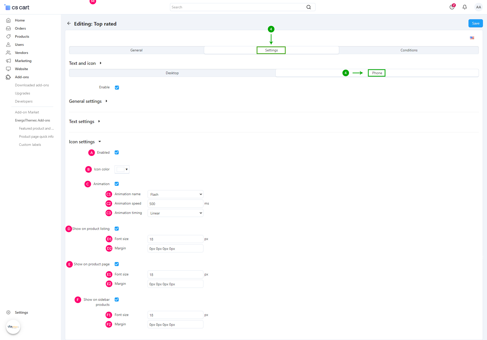
Phone - Icon settings
-
C1: Animation name - Here you have 13 options that you can select from the dropdown:
- - Flash
- - Pulse
- - RubberBand
- - Swing
- - Tada
- - Wobble
- - Rotate
- - ShakeX
- - ShakeY
- - HeadShake
- - Jello
- - HeartBeat
- - Flip
- C2: Animation speed - Enter the speed of the animation in milliseconds. So if you want the animation to take half a second use 500ms and if you want it to take five seconds use 5000ms
-
C3: Animation timing - Here you have 5 options that you can select from the dropdown:
- - Linear - The animation has the same speed throughout its animation cycle
- - Ease - The animation starts slow, speeds up, then slows down
- - Ease-in - The animation has a slow start, then gradually speeds up
- - Ease-out - The animation has a quick start and slow end
- - Ease-in-out - The animation has a slow start and end
- D1: Font size - The size of the Custom label icon in pixels on the product listing
- D2: Margin - Set the margin you want to add outside the Custom label icon on the product listing
- E1: Font size - The size of the Custom label icon in pixels on the product page
- E2: Margin - Set the margin you want to add outside the Custom label icon on the product page
- F1: Font size - The size of the Custom label icon in pixels on the sidebar products
- F2: Margin - Set the margin you want to add outside the Custom label icon on the sidebar products
- Step 5
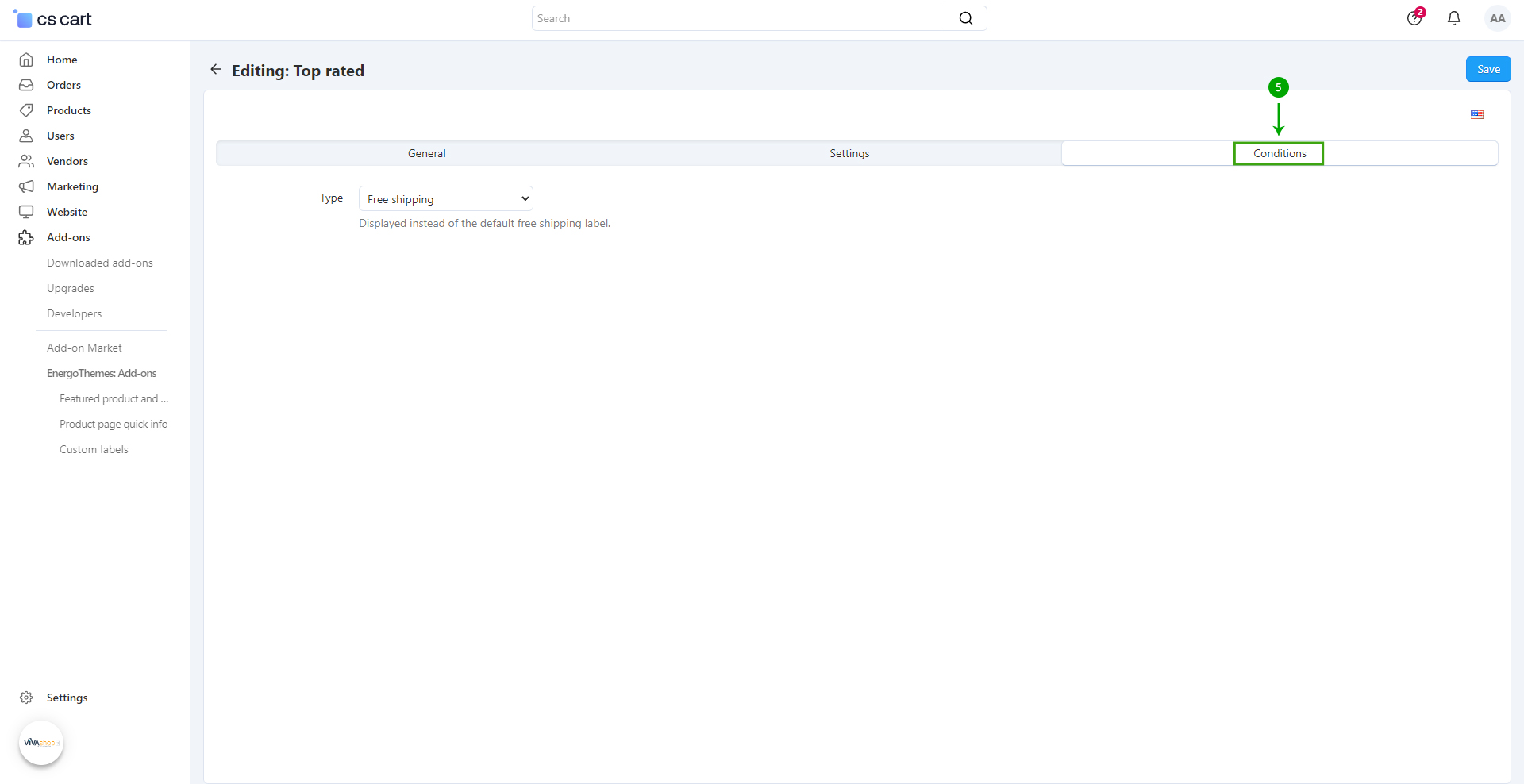
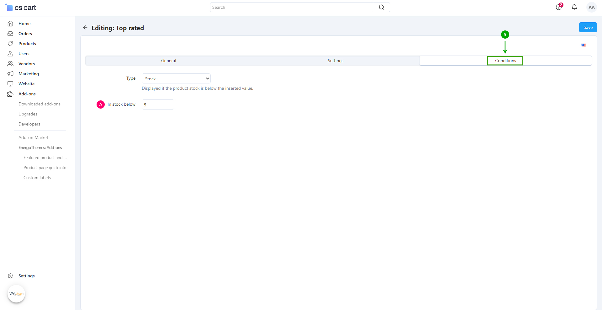
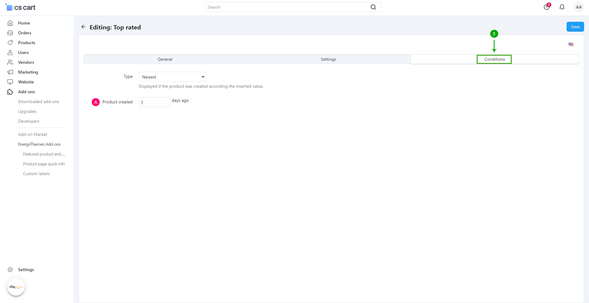
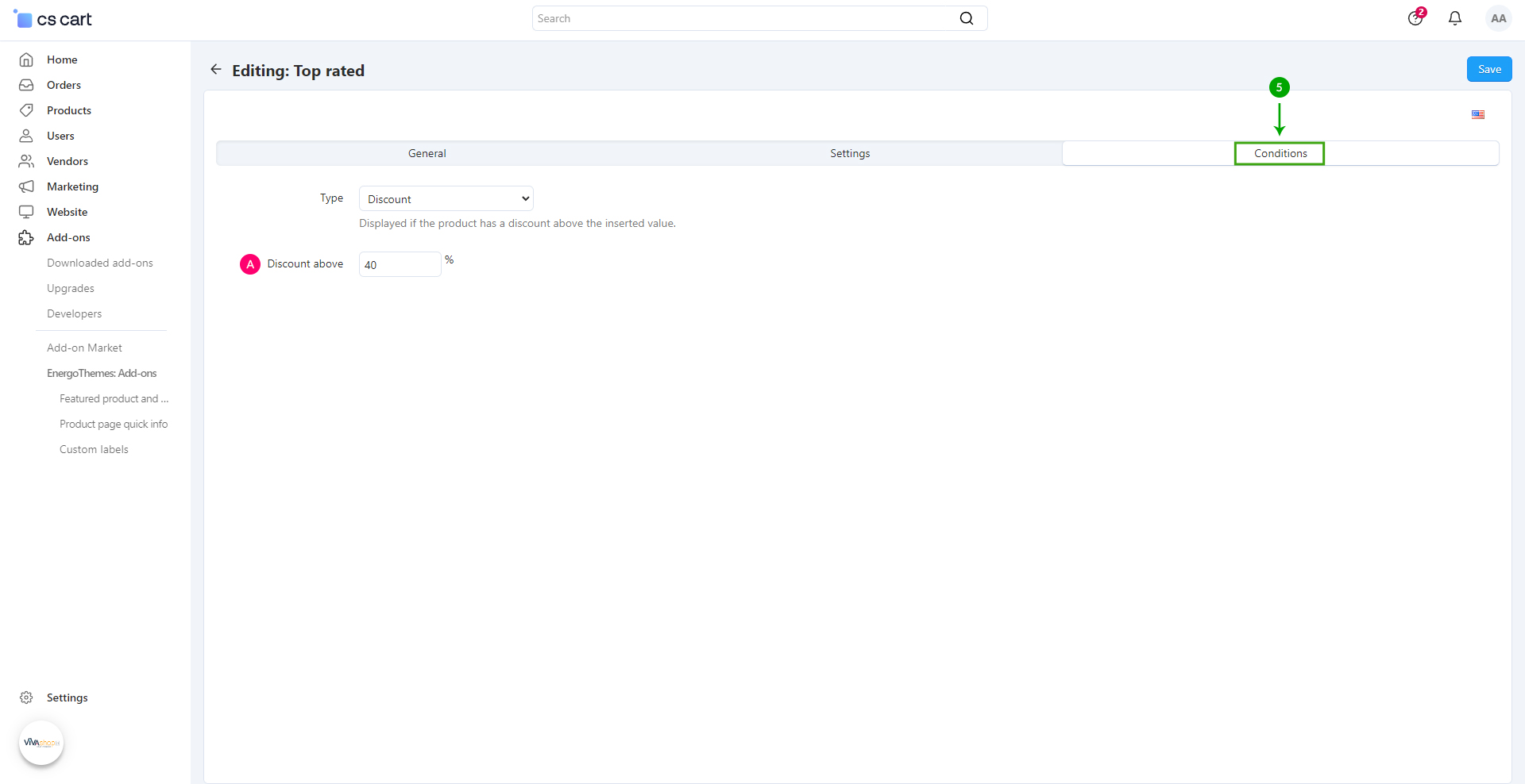
In order to change when the Custom label is displayed, click on the “Conditions” tab
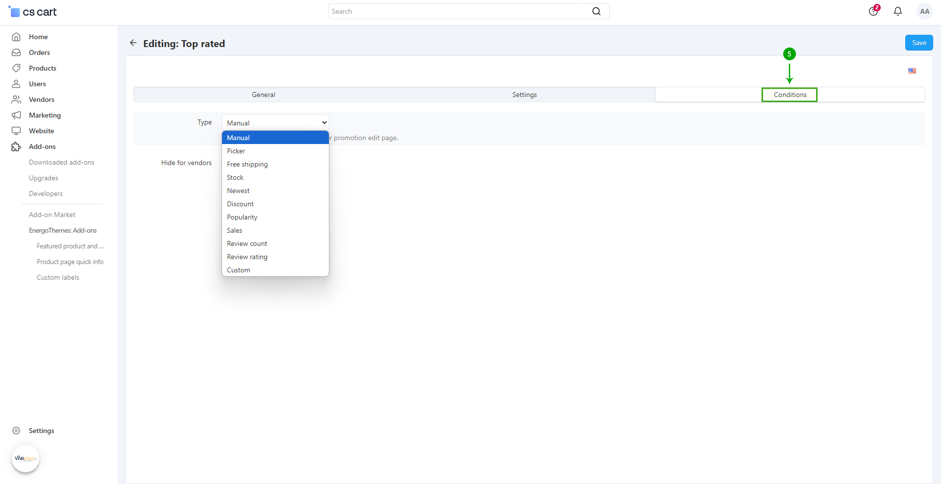
- - Manual - Manually assign from the product or promotion edit page
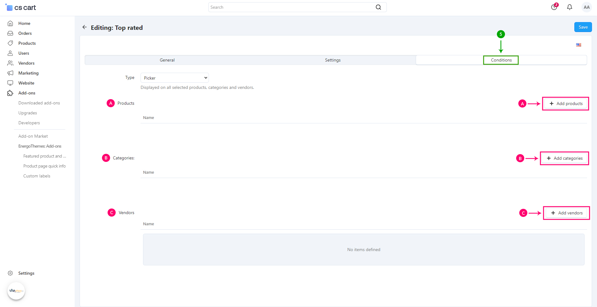
- - Picker - Displayed on all selected products, categories and vendors (vendors picker available only on Multi-Vendor installations)
- - Free shipping - Displayed instead of the default Free shipping label
- - Stock - Displayed if the product stock is below the inserted value
- - Newest - Displayed if the product was created according the inserted value
- - Discount - Displayed if the product has a discount above the inserted value
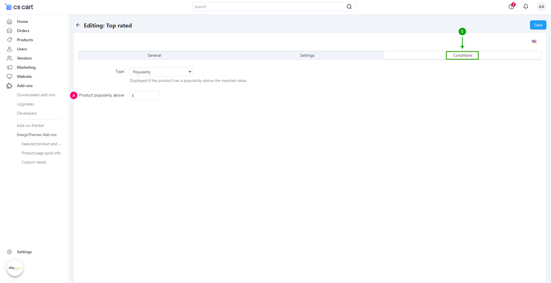
- - Popularity - Displayed if the product has a popularity above the inserted value
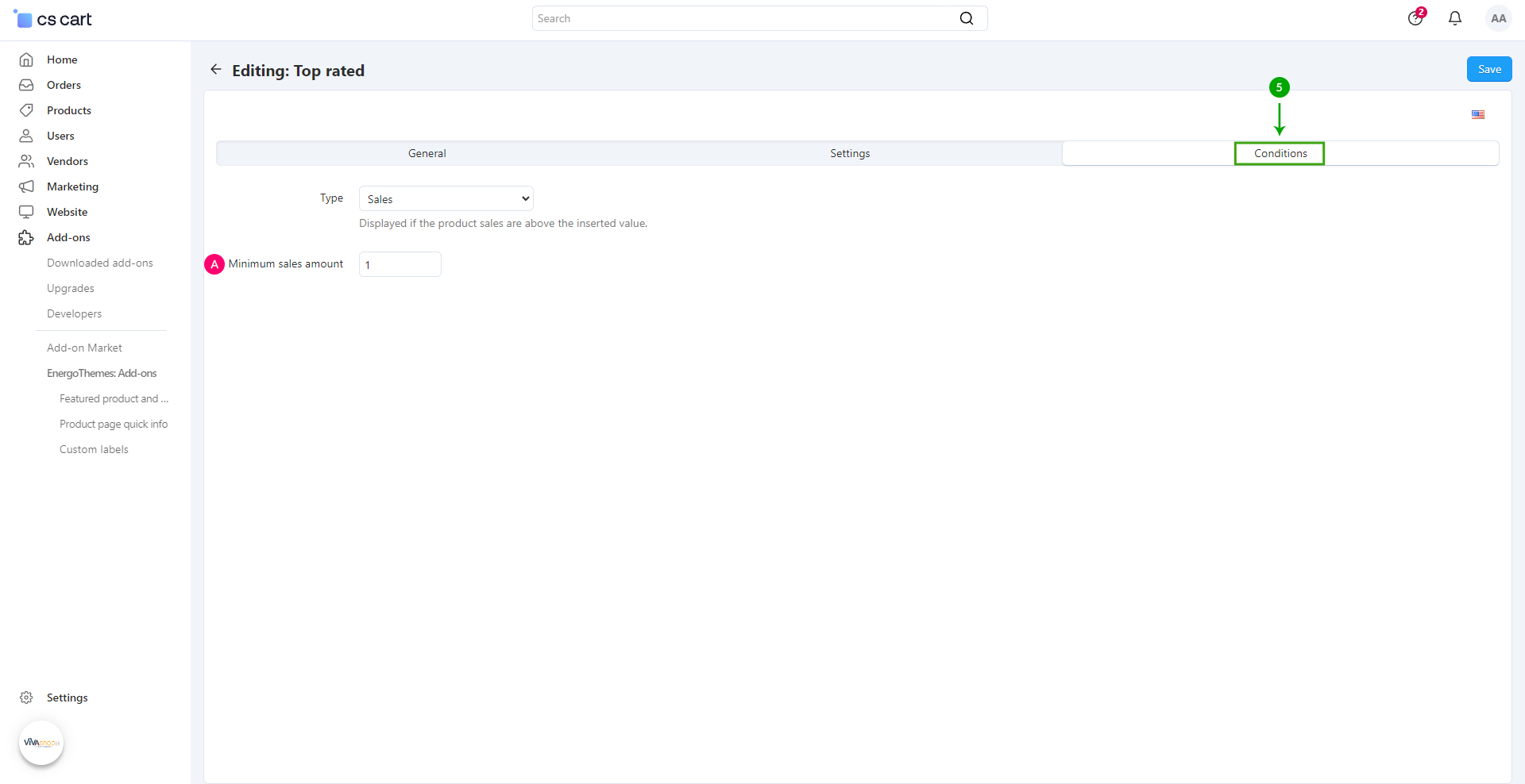
- - Sales - Displayed if the product sales are above the inserted value (requires the core addon "Bestsellers & On-Sale Products" active)
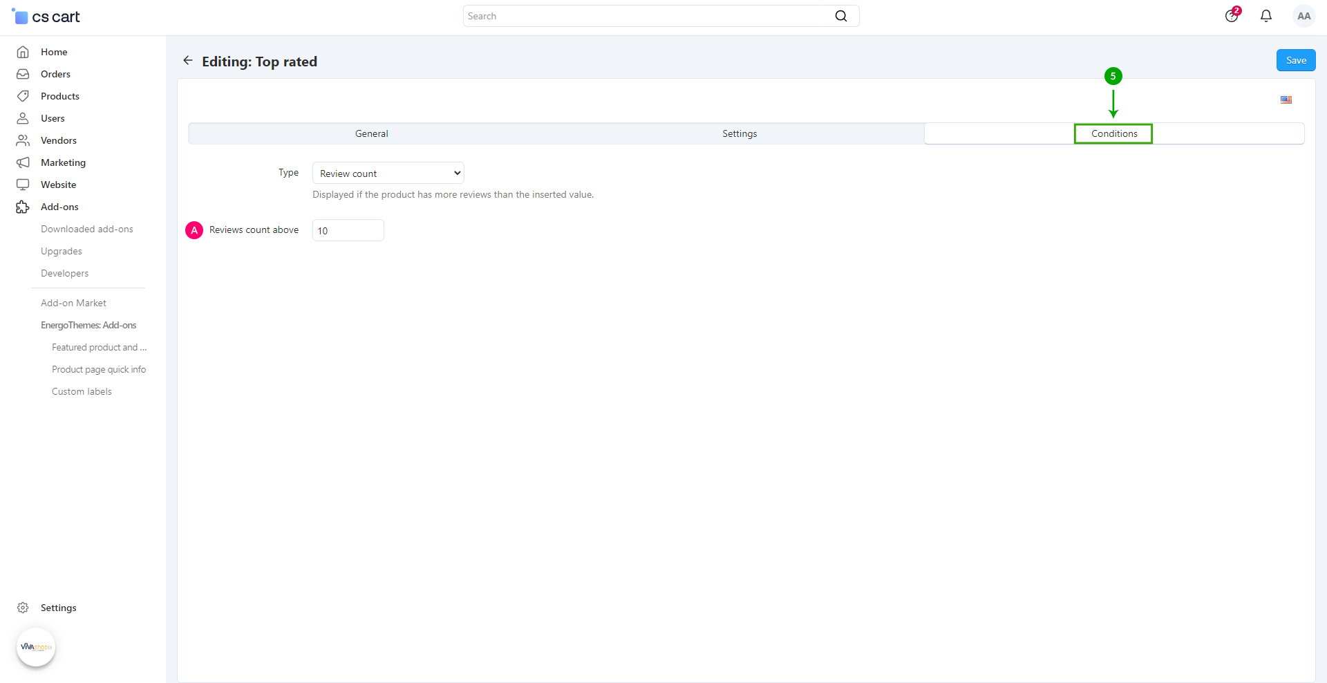
- - Review count - Displayed if the product has more reviews than the inserted value (requires the core addon "Product reviews" active)
- - Review rating - Displayed if the product reviews average rating is above the inserted value (requires the core addon "Product reviews" active)
- - Custom - Displayed if the product meets any condition
Type - Manual

Type - Picker
Type - Free shipping
Type - Stock
Type - Newest
Type - Discount
Type - Popularity
Type - Sales
Type - Review count
Type - Review rating

Type - Custom
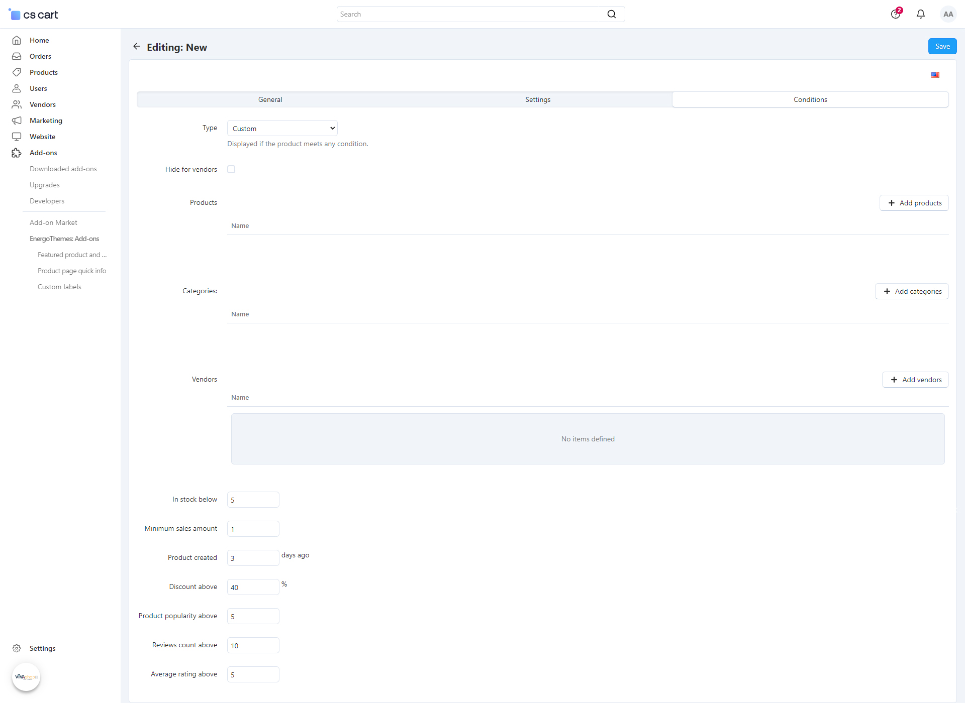
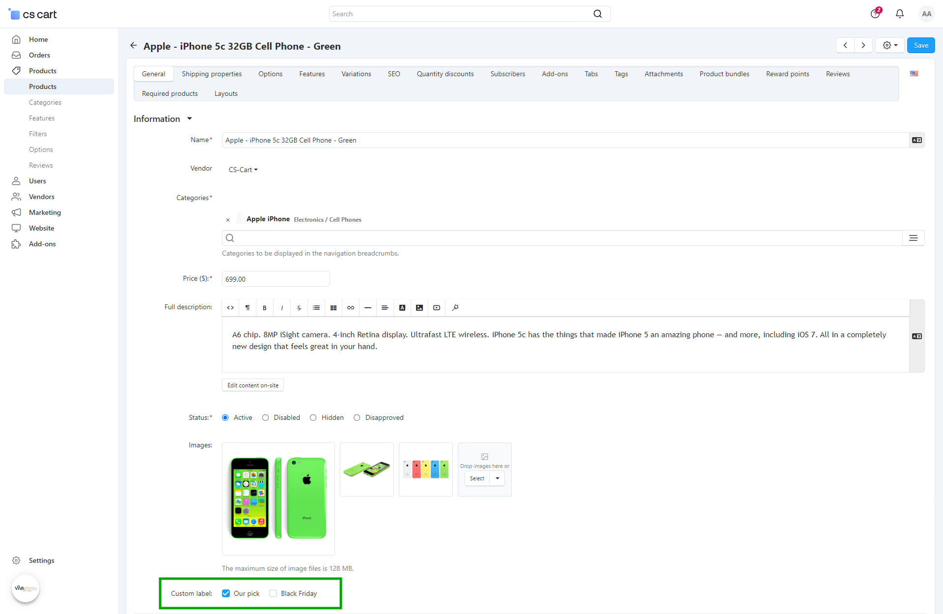
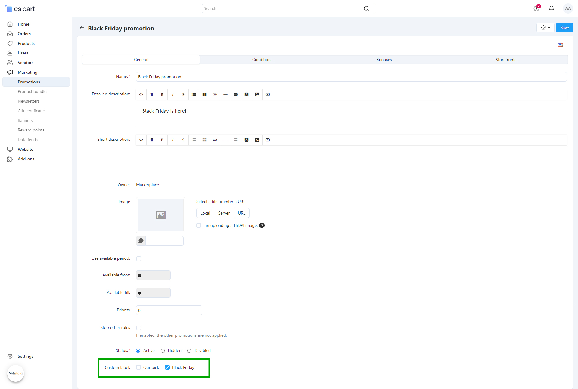
Custom Labels with the Type either Manual or Custom can be manually assigned to products from the product editing page
Product editing page location
Promotion editing page location
- Step 6
Repeat all of the above steps in order to create as many “Custom Labels”, as well as customize them as per your own needs.
